-

Grand Gestures
7.5 × 9.45 inches, 580 pages, hardcover
ISBN 978-1-941753-89-7
Design by Nick Massarelli & Mark Owens
Published by Inventory Press & Vleeshal Center for Contemporary Art
Now Shipping!
Grand Gestures is a visual overview of a decade of Amanda Ross-Ho’s career. Presented chronologically, it documents the artist’s techniques of scaling and replication, and the use of found objects, illustrating how she uses these methods to transform everyday items into works that explore themes such as loss, time, and preservation. Ross-Ho’s interest in manipulating perceptions of time and space, often through theatrical installations, reveals the relationship between art, labor, and systems of production. An essay by critic Catherine Taft examines Ross-Ho’s conceptual approach to archives, materiality, and time. By acknowledging the incompleteness of archives, including in her own, Ross-Ho integrates the inevitability of absence into her work, raising questions about how we document and preserve history.
A conversation between the artist and book editor Roos Gortzak offers additional insight into her work, labor, systems of production, and the making of this publication. -

Entre chien et loup
7.5 × 9 inches, 192 pages, softcover
ISBN 978-1-941753-91-0
Design by Berger studio & de Mars
Now shipping!
Fabienne Lasserre: Entre chien et loup is both a catalogue and artist book, bringing together three essays, a conversation, and numerous images of the artist’s work, process, and inspiration. Entre chien et loup (an expression for twilight), speaks to the way Lasserre’s work defies easy categorization, hovering around, across, beyond, and beside painting and sculpture. For Lasserre, abstraction is a means to privilege lived and felt experience, implying powerful and fertile political metaphors. Contributions by curators Camila Marambio and Dean Daderko, art historian Nell Andrews, and artist Kristine Woods, all presented in both English and French, provide intimate and lyrical weaving of viewpoints on materials, the senses, resistance, and queer and feminist viewpoints. -
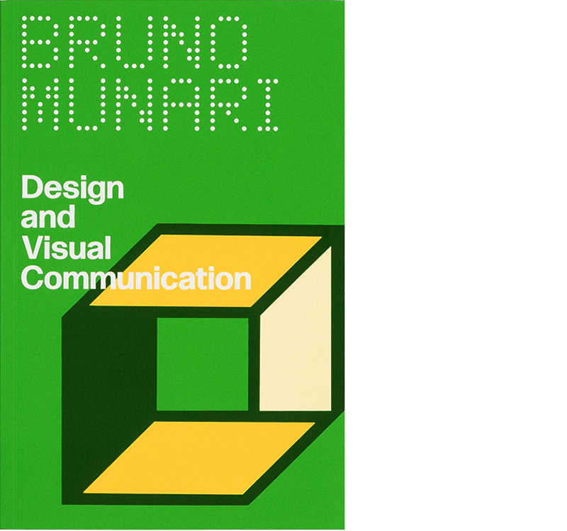
Design and Visual Communication
5.375 × 8.25 inches, 400 pages, softcover
ISBN 978-1-941753-71-2
Design by IN-FO.CO
Now shipping!
“Visual communication encompasses drawing, photography, three-dimensional modeling, and film; abstract and realistic forms, static and moving images, simple and complex ones as well. It extends to questions of visual perception such as the relationship between figure and ground, camouflage, moiré patterns, optical illusions, illusory motion, mirages, the persistence of vision, and afterimages. It includes every aspect of graphics, from the design of typographical fonts to newspaper page layouts, from exploration of the limits of word legibility to the techniques that facilitate the reading of texts. All these facets of visual communication share something in common: objectivity.”
—Bruno Munari
Design and Visual Communication—the first-ever English translation of Bruno Munari’s extraordinary Design e Comunicazione Visiva (1968)—remains an important guide to bridging design education and everyday life. Published after Munari served as visiting professor at Harvard’s Carpenter Center, Design and Visual Communication takes over fifty lessons, class materials, and even letters home in which he describes life in America, and transforms them into a book about the future of art, architecture, and design. Conceived as a living volume, the book was written as inspiration to current and future designers to push beyond the past, however recent, and develop new tools to see and understand tomorrow’s world.
The facsimile reprint is accompanied by new contextual annotations by Munari scholar and design historian Jeffrey Schnapp. These micro-interventions highlight the innovations that make this work as relevant today as when originally published. -

Fantasy
4.5 × 7 inches, 240 pages, softcover
ISBN 978-1-941753-70-5
Design by IN-FO.CO
“But isn’t imagination also fantasy? And can’t fantastic images also assume the form of sounds? Musicians speak of sonic images, sound objects. How does one invent a fish tale, an air-cooled engine, a new plastic?… fantasy, invention, creativity think; imagination sees.”
—Bruno Munari
Never-before translated into English, Bruno Munari’s Fantasy (Fantasia, 1977), invites the reader to explore their own imagination, creativity, and fantasy through a journey in Munari’s mind and work experience. His theory of creativity, developed in conversation with the Reggio Emilia approach and the work of Jean Piaget, foregrounds the book’s journey through Munari’s own design processes, and his work for clients and with children.
By turning life and work into a classroom, Munari unlocks a path through imagination in order to access his, and in turn our, deepest sense of play. The facsimile reprint is accompanied by new contextual annotations by Munari scholar and design historian Jeffrey Schnapp. These micro-interventions highlight the innovations that make this work as relevant today as when originally published.
-

A *Co-* Program for Graphic Design
6 × 9 inches, 256 pages, softcover
ISBN 978-1-941753-72-9
Design by IN-FO.CO
Now shipping!
Event updates here: a-co-program-for-graphic-design.orgEvent updates here: https://a-co-program-for-graphic-design.org
“Over the years, David has shown me that design isn’t just about aesthetics or function—it’s about collaboration, experimentation, and constantly questioning what design can be. A *Co-* Program for Graphic Design is a fundamental exploration into the history of design, how it has shaped our society and reveals the often overlooked power that design holds in shaping our future.”
—Martine Syms, Artist and filmmaker
“'All together now,' as The Beatles sang in 1967. Those three simple words seem to be at the core of David Reinfurt’s argument, as he convincingly shows that graphic design, as a living practice, exists exactly in the intersection of multiplicity (‘All’), collectivity (‘Together’), and modernity (‘Now’).”
—Experimental Jetset, Graphic design studio
From ancient Rome to outer space, A *Co-* Program for Graphic Design features contributions by Danielle Aubert, Tauba Auerbach, Barbara Glauber, Shannon Harvey, Adam Michaels, Philip Ording, and Adam Pendleton. This collectively driven text expands David Reinfurt’s pragmatic and experimental approach to pedagogy into a collaborative project that weaves together a multiplicity of voices to present a polyphonic approach to design history and teaching.
This book extends Reinfurt’s highly acclaimed A *New* Program for Graphic Design to include material from three new Princeton University courses (Circulation, Multiplicity, and Research) expressly designed for online teaching.
These courses present a *co-*llaborative and *co-*operative way of telling and teaching design history, taking on subjects from the Detroit Printing Co-op, Corita Kent, and Charles and Ray Eames, to Marshall McLuhan, Sylvia Harris, and Virgil Abloh. Through a series of in-depth historical case studies and assignments that progressively build in complexity, the book serves as a practical guide to visually understanding the history—and shaping the future—of our designed world. -

A Queer Year of Love Letters | Alphabets Against Erasure
6 × 9 inches, 120 pages, softcover
ISBN 978-1-941753-79-8
Design by IN-FO.CO
Co-published by Inventory Press & Library Stack
ePub edition available via Library Stack
Now Shipping!
"This book skillfully and lovingly re-conceives of typography as a prime vessel for smuggling, as an instrument for remembering and imagining, and as both a time keeper and time traveler."
—Tauba Auerbach
"Yes, yes and more yes! This is the book everyone's mothers brothers cousins uncle and then some have been waiting for. It's all that and a bag of percolated barbecue truffle potato chips. If thats not enough, and you may think it isn't, one gets as a bonus the glorious G. B. Jones being interviewed in poetic depth–sublime."
—Vaginal Davis
"The word "erasure" makes me think of erasers. This book is a pencil. Write with it."
—Ellen Lupton
A Queer Year of Love Letters: Alphabets Against Erasure is a toolkit for writing and remembering queer and trans histories. Expanding on Nat Pyper’s series of fonts whose letterforms derive from the life stories and printed traces of countercultural queers of the last several decades, this new book showcases overlooked biographies alongside previously unseen archival materials, as well as Pyper’s unique approach to designing fonts as containers for memory.
The book debuts a new essay by Pyper, and includes contributions from Paul Soulellis, Claire Star Finch, Silas Munro, Lukaza Branfman-Verissimo, Rosen Eveleigh, and G. B. Jones that offer vital perspectives on queer archival practices, language lineages, design as protest, and love as the basis for research. Part reader, part type specimen, part love letter, these fonts foreground the politics of queer memory while opening up new avenues for writers, designers, and curious readers.